
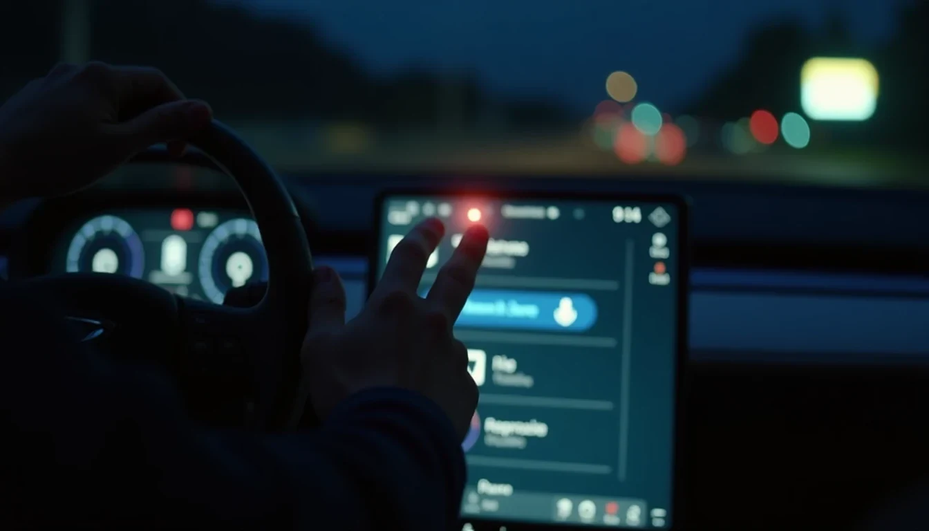
Modern cabins have made a strange trade. The screen looks cleaner, the dashboard costs less to build, and the salesman can point to a giant panel and call it progress. Drivers want to switch off lane intervention, clear a misted screen, or turn the fan down on a wet night road, and suddenly the car behaves like a badly organized laptop.
A touchscreen is perfectly useful for maps, media, and camera views. The trouble starts when essential functions get pushed behind layers of icons, menus, and sub-menus while the car is moving. This often happens at the exact moment the road surface turns rough or the sun hits the glass at the wrong angle.
The test that exposes the lie
A clean way to judge these systems is to stop talking about style and start timing tasks. In a five-car test, the point is to measure how long it takes to adjust cabin temperature, change fan speed, activate demisting, switch off lane intervention, choose a radio station, and then get back to navigation, all without voice control.
Do it once in daylight. Then do it again at night. Repeat the same drill on a poor road, because that is where clever-looking interfaces usually fall apart. A stationary demo in a showroom tells you nothing about what happens when the car is bouncing, the cabin is bright with reflections, and your right hand is trying to find a tiny on-screen target with no tactile reference.
Physical controls keep earning their place. A proper knob, rocker switch, or button can be found by feel. A touchscreen asks for a glance, then another glance, then a correction when the first poke lands on the wrong item. Touch-sensitive steering-wheel pads are hardly better, offering plenty of ambiguity and very little feedback.
Why the screen keeps winning in boardrooms
Manufacturers love the central display for reasons unrelated to driving. One large panel can replace a stack of switches, reduce wiring, simplify trim variations, and give the cabin a cleaner look. It is easier to sell, easier to photograph, and easier to argue over in a design meeting.
The driver pays the price.
Climate control is the obvious casualty. Temperature, fan speed, air direction, and demisting are functions people adjust quickly, often without thinking. Put them behind several screen presses, and the whole cabin becomes a distraction exercise. The same applies to drive modes, parking sensors, stop/start settings, and other functions that are sometimes buried where they should never have been.
Euro NCAP sees the direction of travel clearly enough to act on it. Its 2026 driver-control assessment will penalize cars that ask for more than two screen steps to operate defined driving functions. Core items such as indicators, hazard lights, wipers, demisting, and the SOS function need to be accessible without a menu hunt for a car to score well. This is common sense finally catching up with cabin fashion.
What works better behind the wheel
Some brands have already proved there is a better balance to strike. Mazda’s Commander Control remains one of the neatest answers because it lets the driver work through infotainment without turning the whole dashboard into a finger-fiddling contest. BMW’s iDrive controller does the same job in a different style, with enough haptic certainty to make menu diving less irritating and less blind.
Hyundai and Kia often land in a smarter middle ground than their rivals. Their best cabins pair a large screen with real buttons and dials for climate and shortcut functions. Porsche, even when it goes heavy on display real estate, usually leaves a sensible set of physical controls close to hand where they belong. Mercedes-Benz MBUX gives the driver several ways in, including voice and other input methods, although some versions still push too much climate control into the screen. Older Volvo Sensus layouts, with their permanent climate strip and home button, also understood that a driver should not have to excavate basic functions.
That mix matters because different tasks demand different tools. Navigation and camera views suit a large display. Radio browsing can live there too. But the controls you touch while overtaking a truck on the N1 in rain should feel as obvious as the gear lever in an older manual hatchback. Muscle memory exists for a reason.
The road conditions no studio render can fake
Bright sun can wash a screen out. Night driving can make the backlighting irritating. Rough roads can turn a simple tap into a second attempt, then a third. Add wet fingers, fingerprints, and the usual South African mix of traffic, dust, and uneven surfaces, and a clean interface on paper starts to look very different in real use.
Touchscreen obsession becomes especially lazy. A system that works in a parked car under showroom lights may become clumsy the second the vehicle is moving, the cabin is hot, and the road is doing its best impression of corrugation. The problem is not the presence of a display. The problem is burying high-frequency controls behind graphics that demand precision when precision is exactly what the driving environment refuses to give you.
A well-designed cabin does the opposite. It keeps the screen for the jobs screens do best, and it protects the driver from unnecessary interaction when the car is in motion. That is the standard worth judging by. A beautiful dashboard that wastes your attention is not advanced; it is just expensive clutter with a nicer font.
